Hi, I'm Kate and I created WeightGrapher,
I hate my scale when I'm dieting. Monday I'm down a pound, Tuesday I'm up a pound and a half, by Wednesday I'm down two pounds and I have no idea if my diet is working or not. I know I'm mostly gaining and losing water weight, but it still left me feeling unmotivated on Tuesday to see myself weighing more than the day before
When I use most website's graphing functionality, I get similarly discouraged. A simple line graph going over my weight looks like this on most websites.
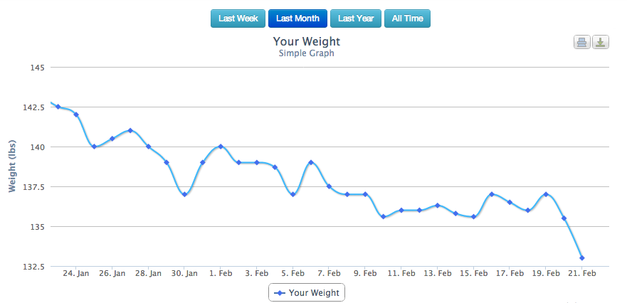
The ups you see on January 26, February first, and sixth seem big, but in reality the entire graph has a trend of losing weight over time. It's hidden between the ups and downs of water-weight.
WeightGrapher solves this problem for me, and I think it will for you too. Graphs like this help me get past the daily fluctuations and see the overall trend of my weight.
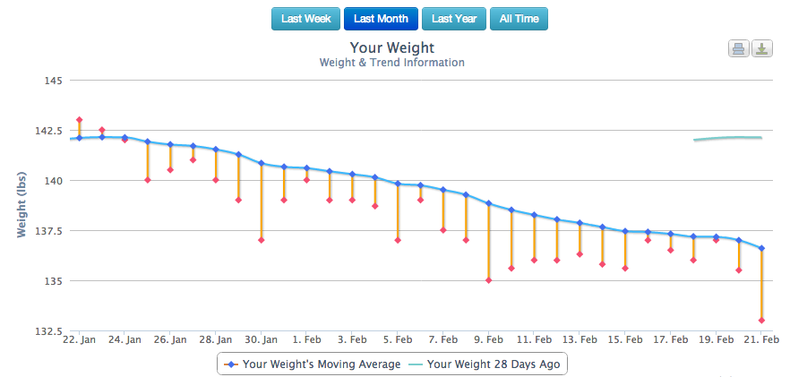
It gives me useful information. My actual weight is in red, while the trend is blue. If the red dot is below the blue line, I'm losing weight. Even if I weigh more today than I did yesterday. The green line in the upper right corner marks where I was 28 days ago. Hormones can cause a pretty big monthly weight cycle, and that lets me see it. Compare it to a simple line graph that most sites use. This is the same weight information, over the same time period.
With this information I can try out any diet and exercise routine and know within a few days if it's working. I could enter all my weight information manually, but I have an Aria scale by FITBIT® that automatically records my weight when I step on. You could do it either way.
Why not try it out for yourself?